
Kawasaki
e-Commerce Checkout
A faster and more intuitive way to purchase your favorite Kawasaki accessories.
Overview
Problem:
Kawasaki seeks to develop a multi-channel
e-commerce platform. Switching venders for the back-end and checkout process on Kawasaki.com.
Needs:
- Centralize the order fulfillment from KMC's distribution centers
- Improve order turnaround time to customers
- Simplify engagement with Kawasaki dealers
Solution:
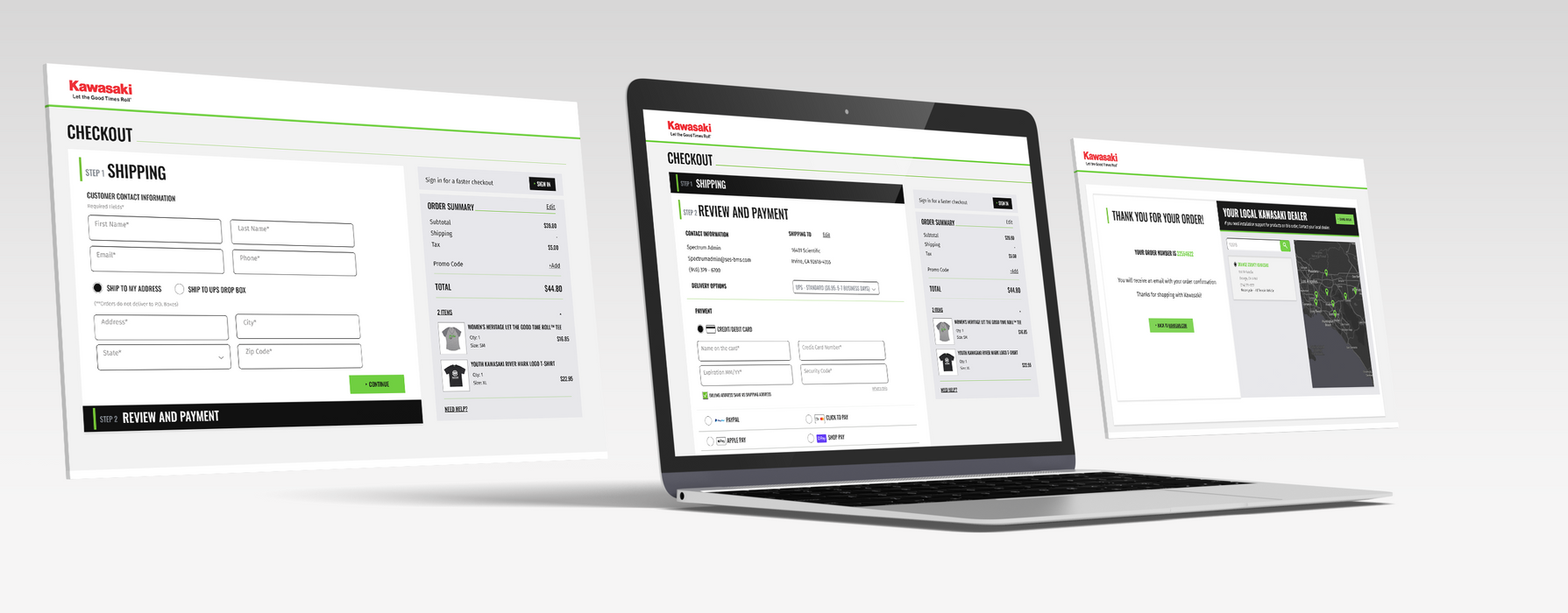
Integration with Kawasaki front-end e-commerce store. Integration with the shopping chart process. Check-out routes to e-commerce management system.
Role:
Senior UX Designer
Tools:
Figma
Adobe XD
Adobe Photoshop
Adobe Illustrator
Approach
01 Research
Competitive Analysis
02 Design
Sketches
Wireframes
Prototype
03 Evaluate
Usability Testing
01 Research
Competitive Analysis
From the initial discussion with the Kawasaki Team I was able to collect the main requirements for improving the existing checkout experience.
I wanted to support my design approach by presenting some competitive analysis to determine how similar platforms approach the check out process.
I identify three main competitors. My research started from a general userface familiar platform like such as Target.
I then proceeded to analyze competitive e-commerce brands. In the end, I analyze how to improve the existing checkout pages on Kawasaki.com.
Reference 1 - Target.com
Model type: Login Required
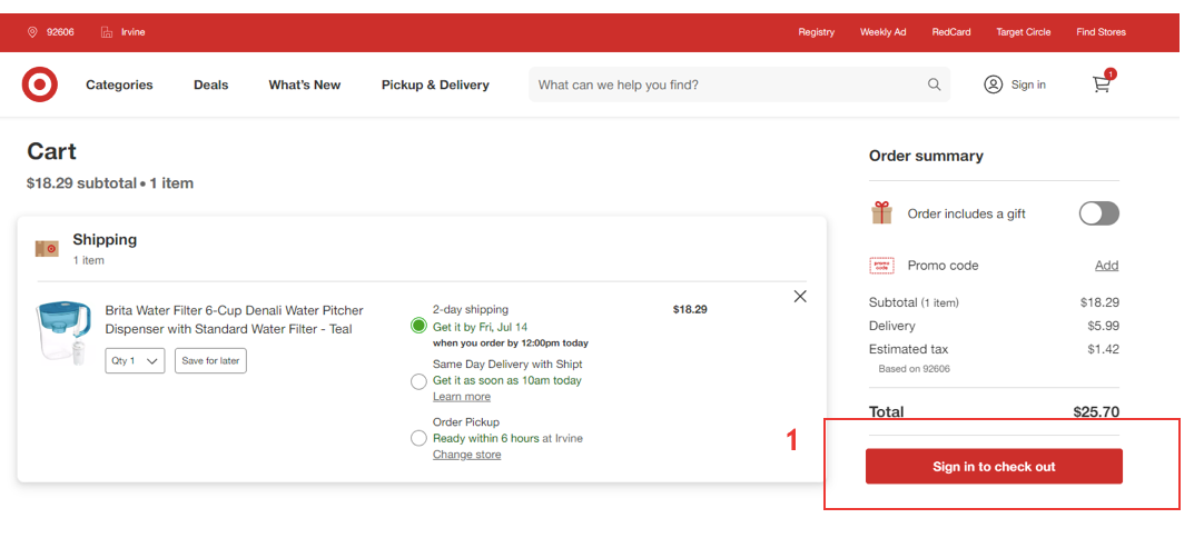
- Customer must sign in to checkout
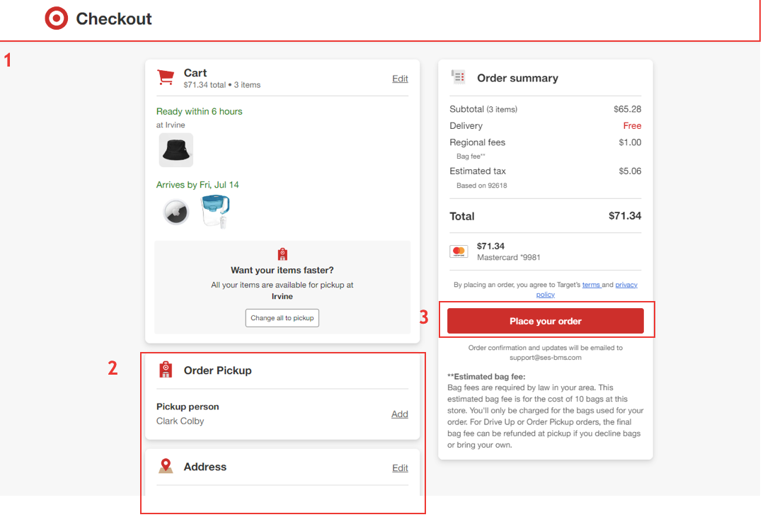
- Checkout header is simplified, additional website navigation links removed
- Customer information is pre-populated from login profile (guests check out with option to create an account)
- Customer only needs to perform 1-click-action to complete the order
Reference 2 - Harley-Davison.com
Model type: No Login Required
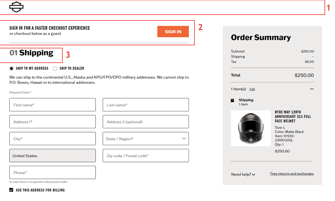
This model is designed knowing some data entry is required prior to purchase.
- Checkout Header is simplified, additional website navigation links removed
- Sign in is recommended to customer to eliminate data entry
- 3-Step Process: Shipping, Billing, Review
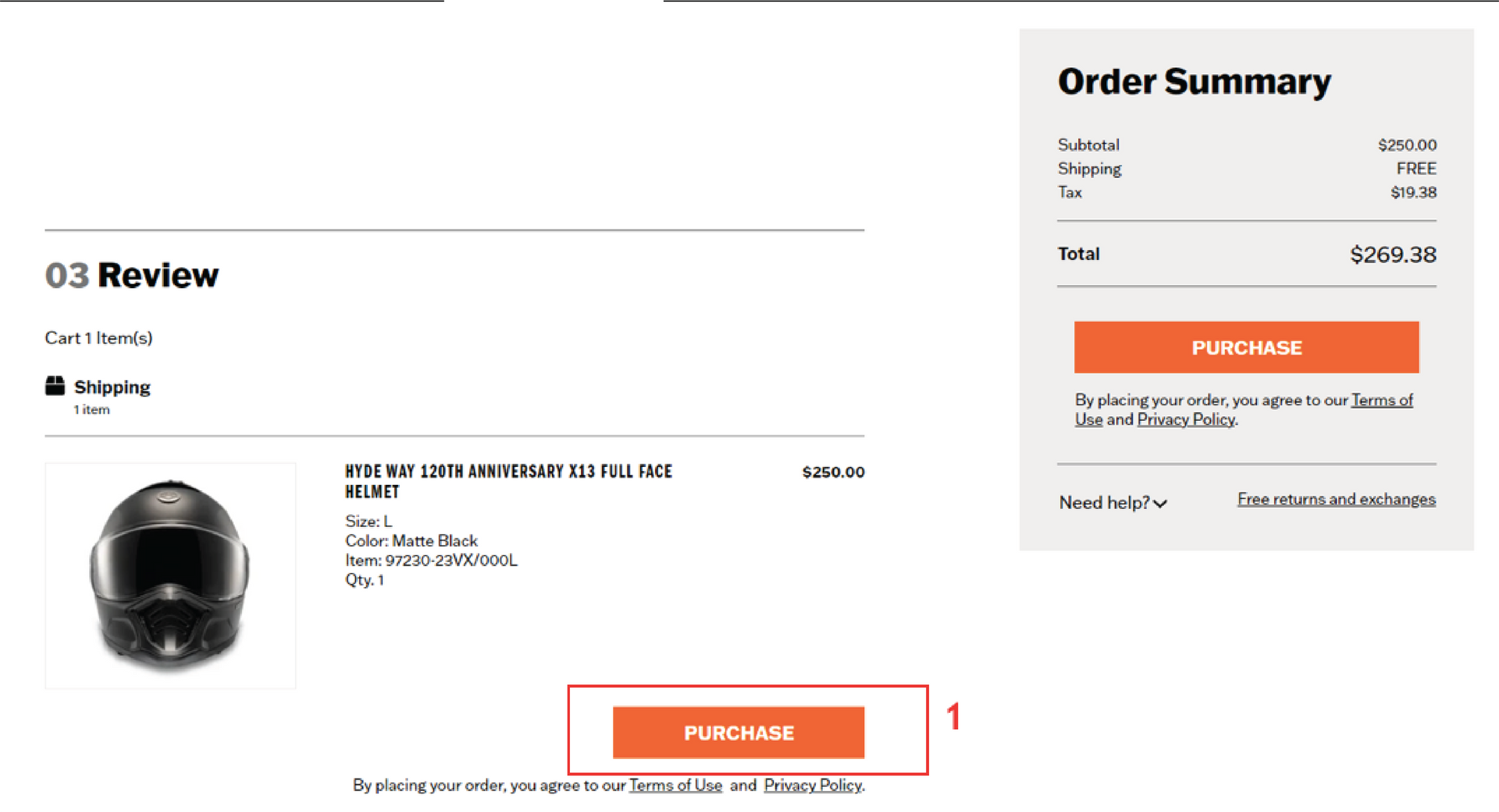
- Purchase button clearly identified at completion of form after step 3
Reference 3 - Kawasaki.com
Previous State - Starting point for improvement
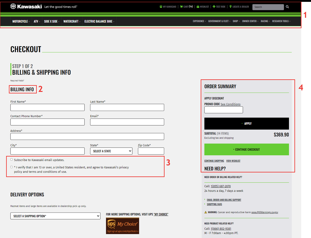
- Full website navigation remains throughout checkout process
- Billing is asked before shipping. Typically billing address is linked to payment input
- Subscribe to email updates - not directly tied to email input. Agreement to privacy policy not tied to order submission
- Order Summary - Promo Code is provided equal weight to continue checkout - potential for user confusion
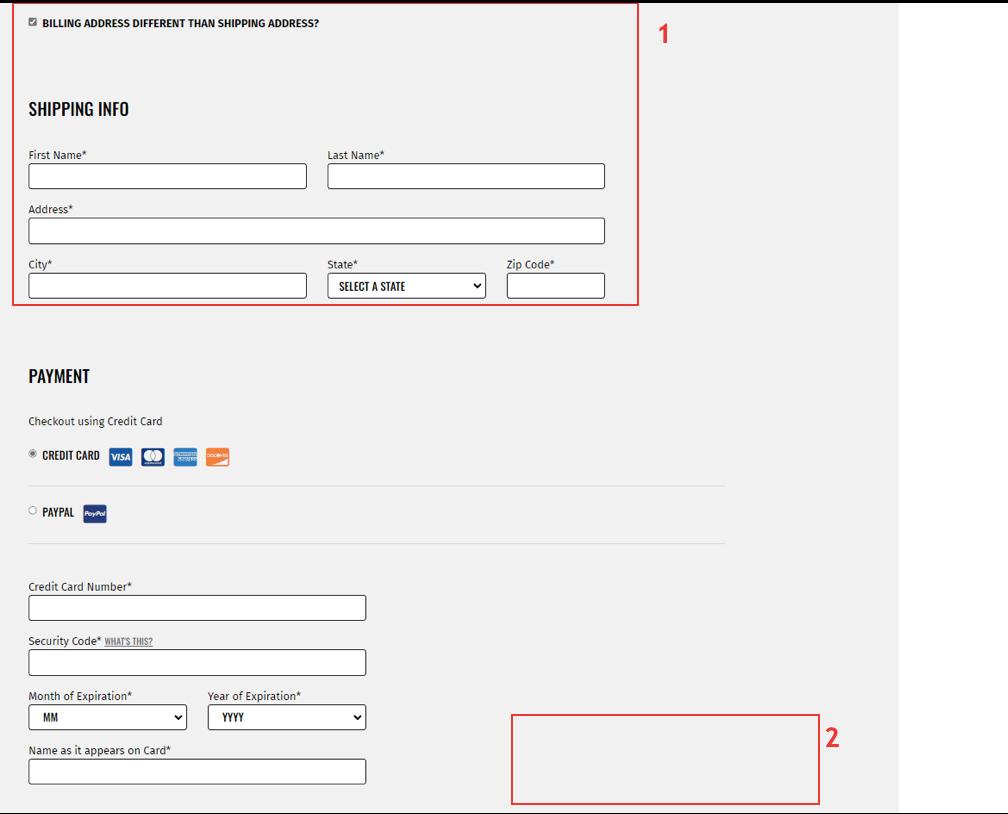
- Shipping address is only asked for if different from billing - this is reverse from most other checkout processes
- Bottom of form contains no action button. User must scroll back to top of the page to continue checkout
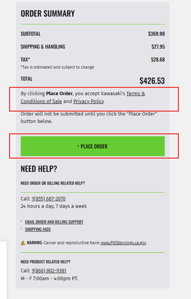
- Kawasaki is stating that by clicking "place order", customer automatically accepts terms and privacy policy. This may be redundant from user having to agree in prior step
- Place Order button is front and center, but does not scroll with the page. If user has multiple items and scrolls to the bottom there is no action button without scrolling back to the top
02 Design
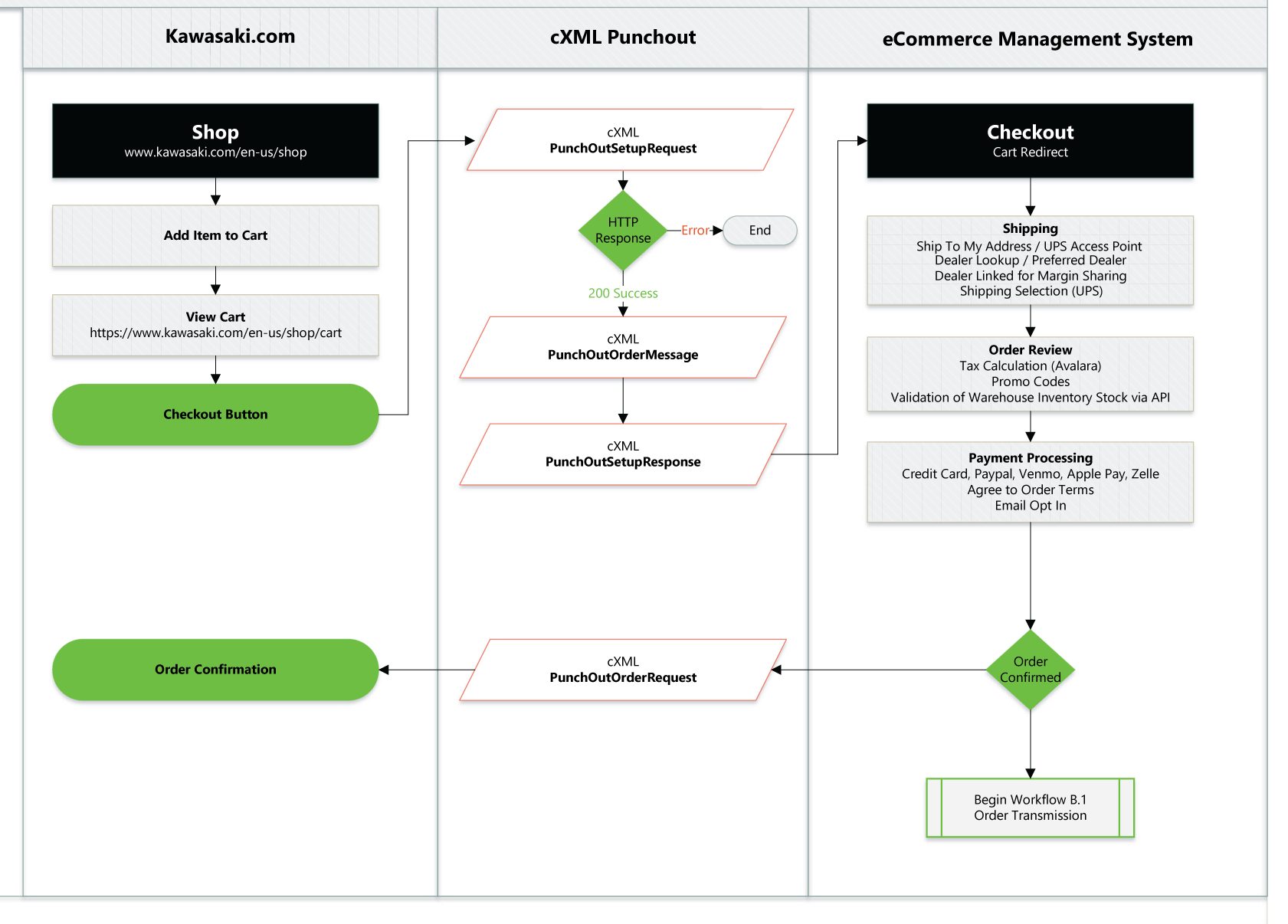
Workflow
Sketches
The Kawasaki team asked us to address the following tasks when designing:
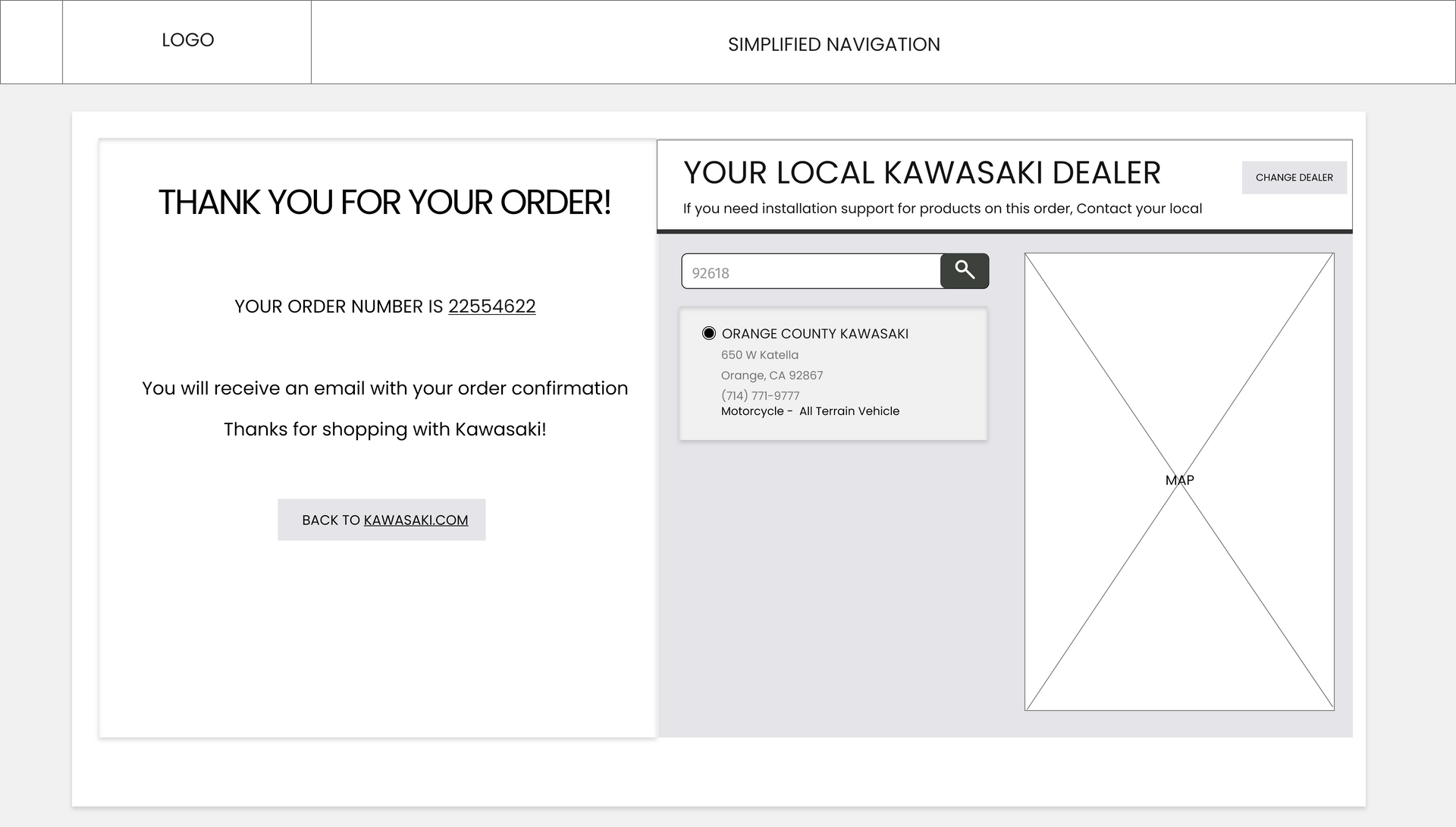
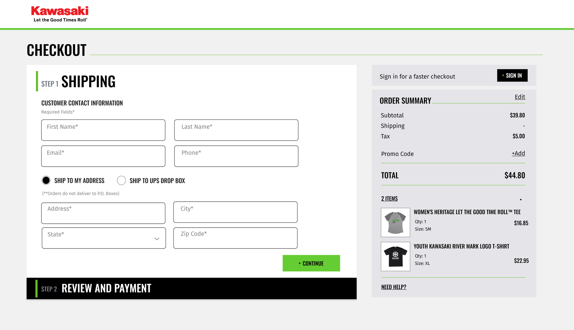
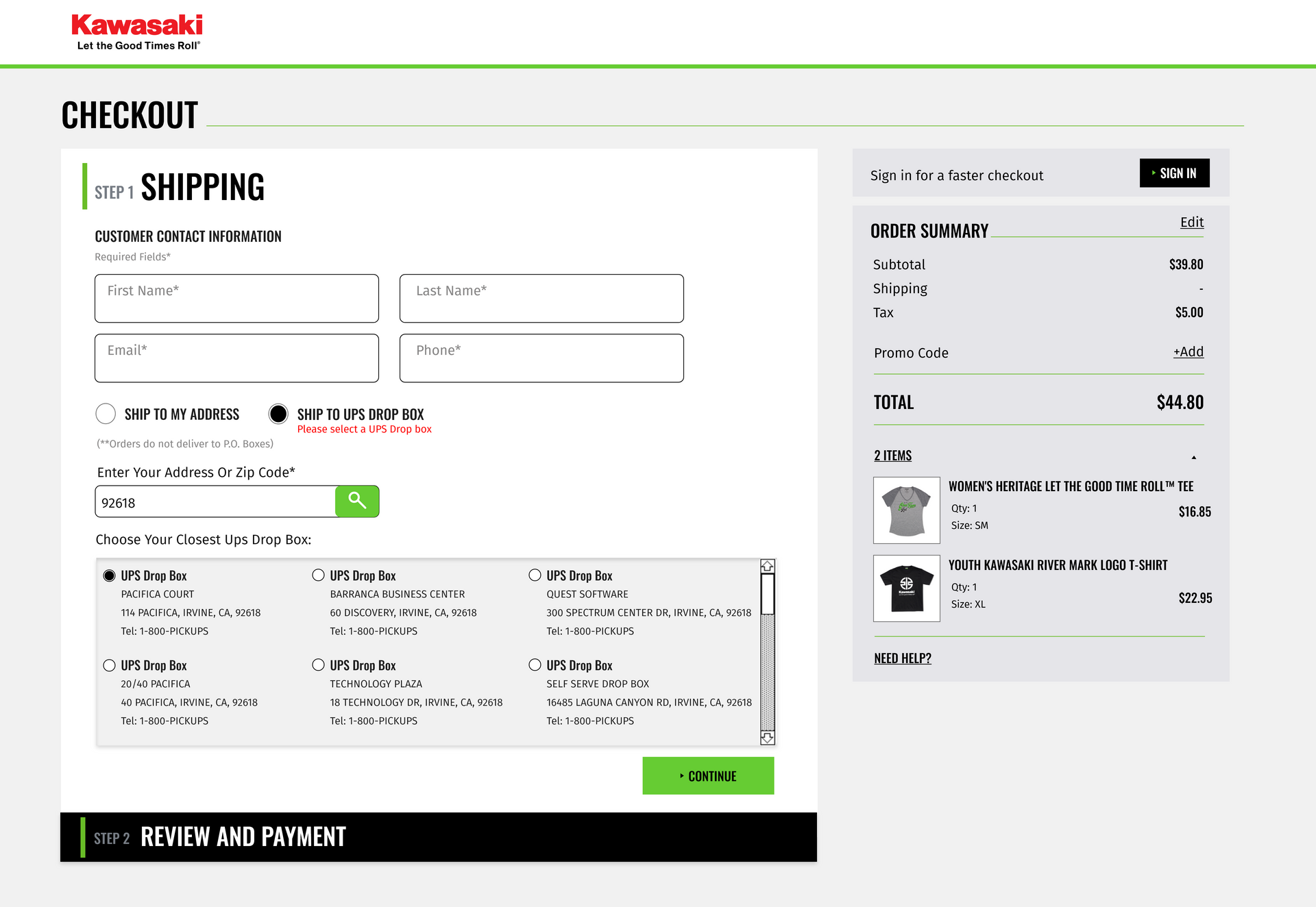
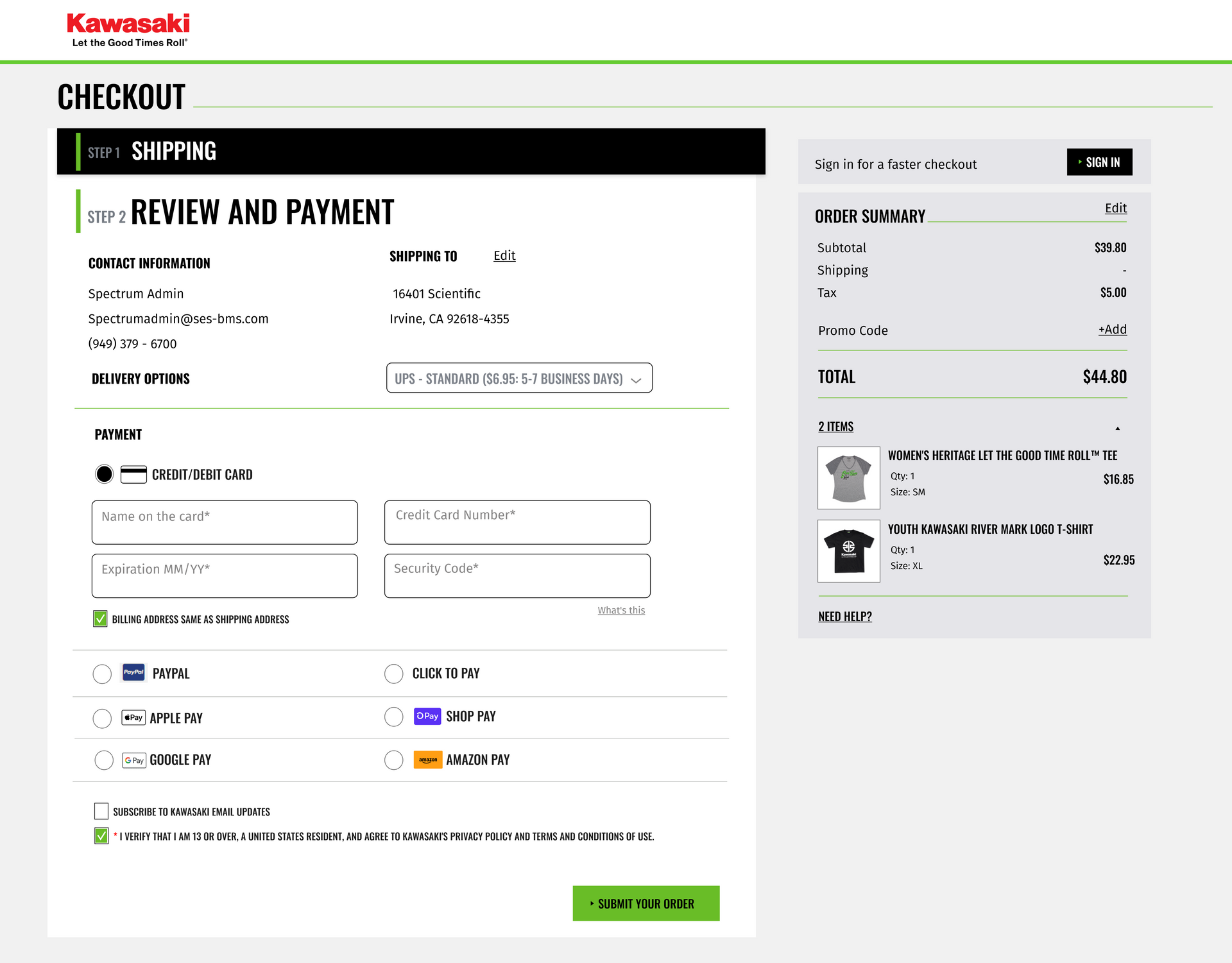
- Introducing into the checkout screens a prompt for the customer to login
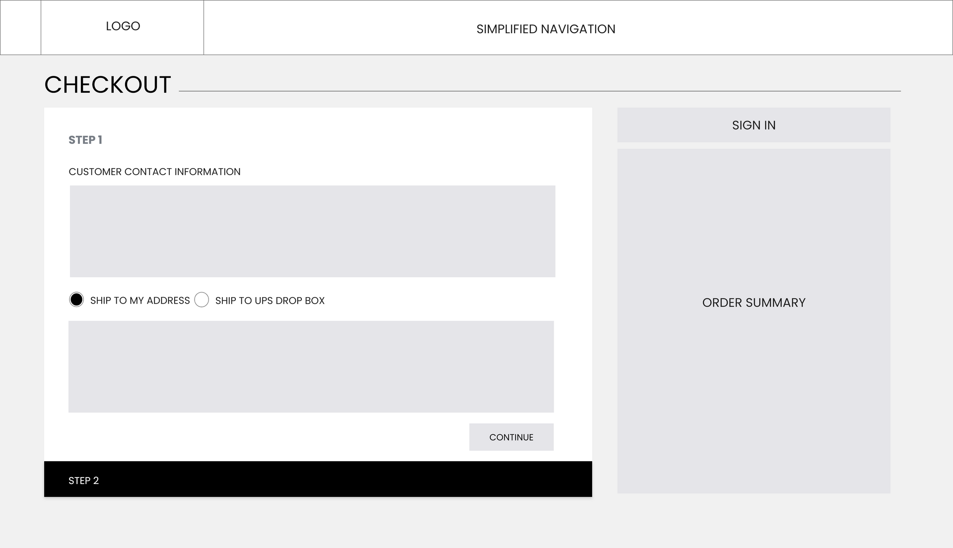
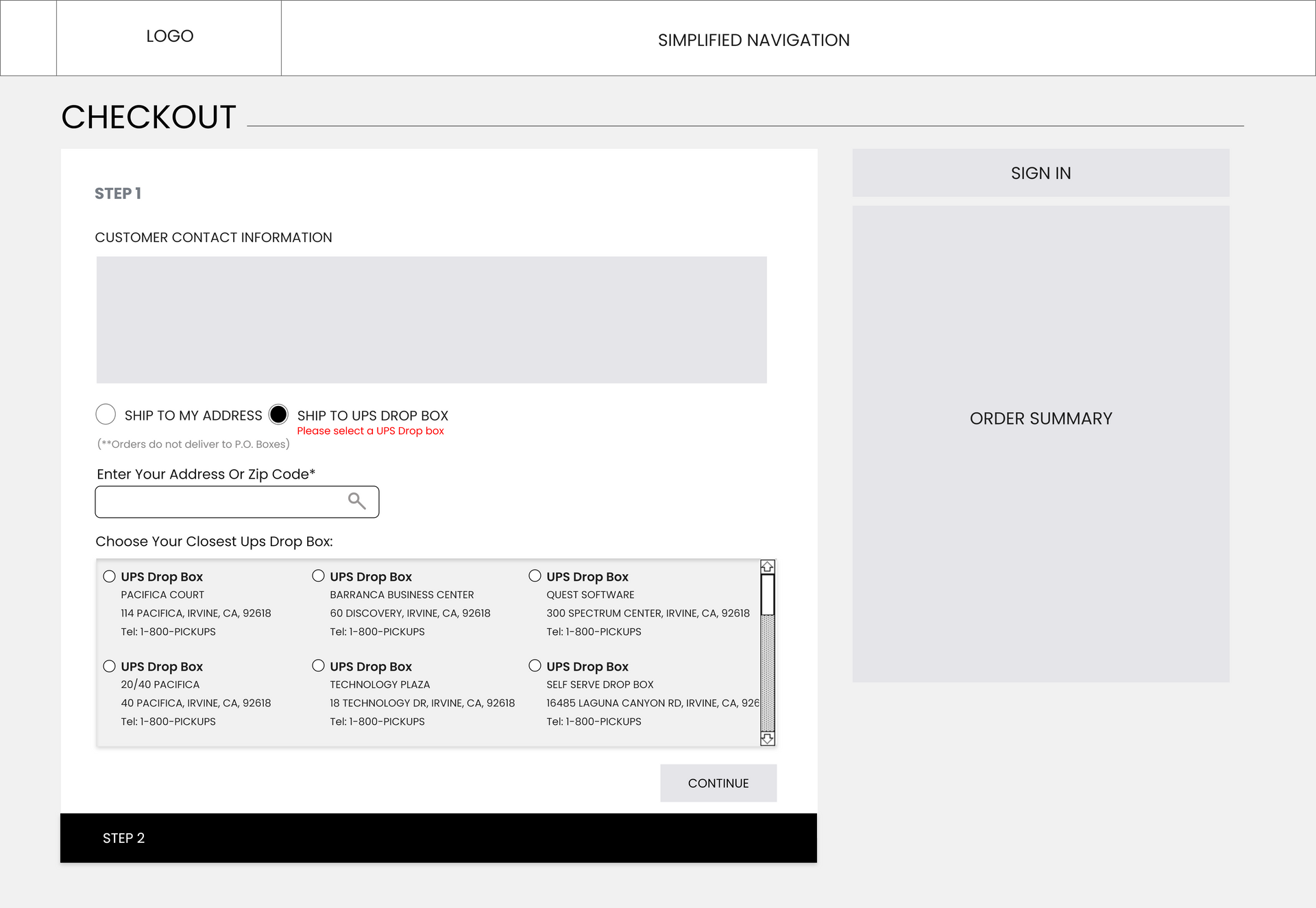
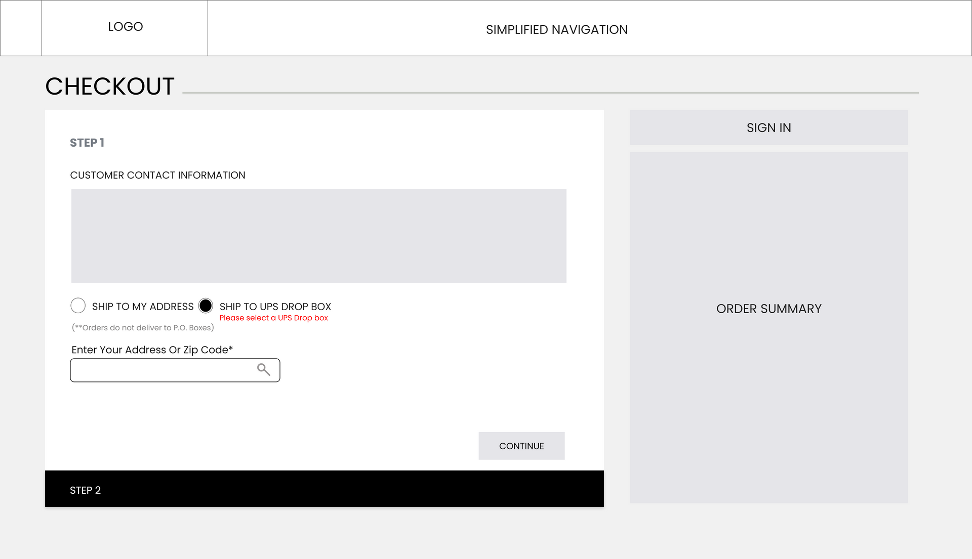
- Possibility to ship the package to a personal address or an UPS access point
- Summary of the products in the cart visible for the customer at the checkout process time
- Possibility to access the help center from the checkout page
- Introducing different payment methods, not only credit / debit card
I sketched out the initial screens to get a further idea of the new layout and approach that I wanted to go with the design. Using the workflow map and competitive research, I started to create a layout that would look easy to scan and integrated with all the requirements.


Wireframes
I developed my wireframes, re-evaluated my sketches, and referenced my competitive analysis to ensure I was designing the best experience for the user.
Prototype
After completing the research, and finalizing the low-fidelity wireframes, I prepared the prototype to present to the Kawasaki team and get their feedback.
The initial checkout prototype did not have the prompt for the customer to create an account/ or login if the account already existed for a faster checkout. After a couple of meetings with the Kawasaki team, more requirements had to be considered.
03 Evaluate
Evaluation
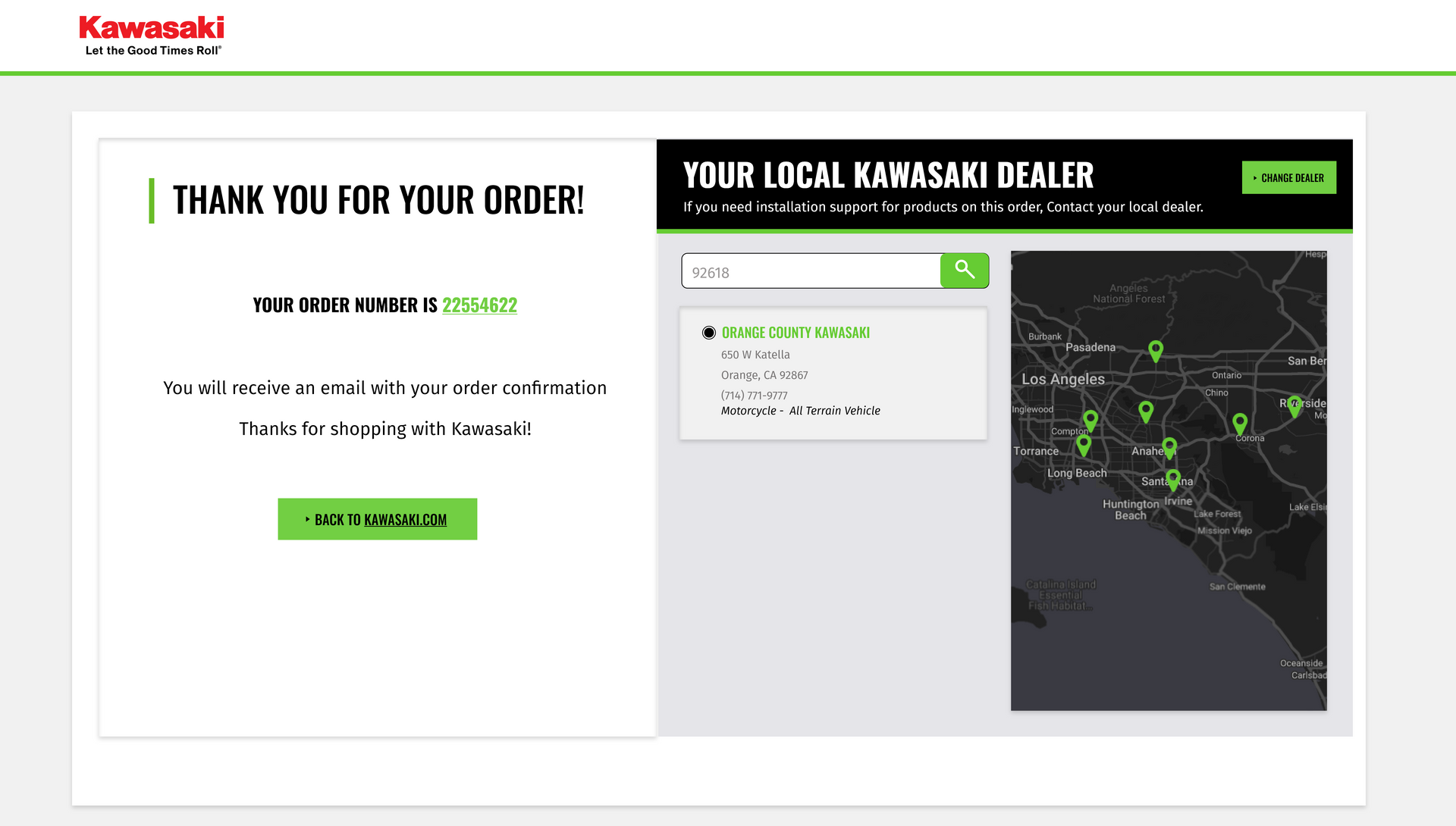
The proposed flow was linear, and easy to follow. When the new checkout went live, the results were remarkable. Not only did we see a significant reduction in cart abandonment rates, but we also observed a noticeable uptick in completed purchases.
After the launch of the new checkout process, my team took care of the help center, and Kawasaki order support. We kept monitoring the type of questions that were coming through. We did not find any customers coming back asking for clarification on how to complete their purchases. The process seemed to be going smoothly.
However, we received a lot of messages related to Kawasaki products. Our Help Center wasn't able to respond, since we were only responsible for the orders support.
We decided to introduce more specific content to the help center to guide the customer to the answers they were looking for.
We decided to give the customer a better understanding of the chat support lines: one related to orders and one related to product specific questions.
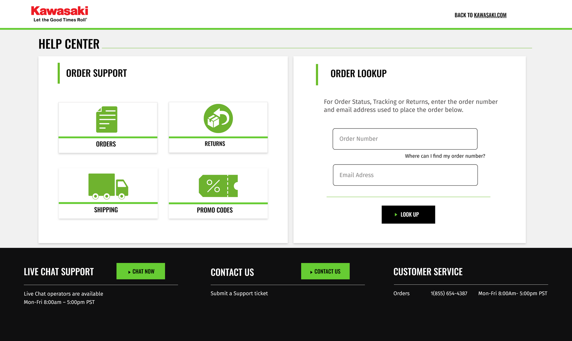
First version of the Help Center
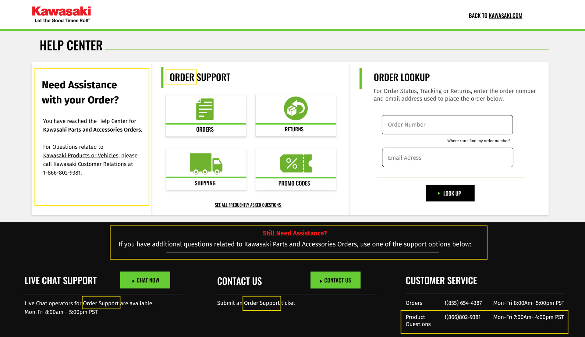
Updated and Final verbage of the Help Center